When I first began work on the mobile sanctuary project, I recognized early on that designing and producing a functional, real-world 3D structure of this sort would be above my pay grade. So I reached out to my friend Gregory Sandoval, an architect whom I’ve known for many years through Albuquerque’s various activist circuits, to gauge his interest in designing, or co-designing, the concept. He took a shine to the idea, as I assumed he would given his social justice proclivities, but his slate was full for several months. So he recommended I approach another architect, Owen Klamme, one of the principal members of a new local firm called Formative Architecture.
Owen and I had an initial exploratory meeting in August of 2019 wherein I shared with him the basic concept and provided a general overview of key features I felt the design needed to incorporate:
fully accessible
accommodate personal and communal use
non-hierarchical
non-ideological
sweat / sauna functionality (ideally)
fostering of tranquility
natural / organic aesthetic
storage (if possible)
I recognized that, in this scenario, I was essentially the client and Owen was the designer, so I did my best to honor my own “macro-micro” approach in not restricting Owen’s creative input by being overly detailed in communicating my (and, by extension, the Zarim’s) needs / wants for the mobile sanctuary — I was doing my best, essentially, to express the “what” while giving Owen as much space as possible to work out the “how.”
Having said that, it was a bit hard for me to completely turn off my design proclivities so I offered some fairly basic thoughts regarding how the “what” could be turned into “how,” while making it clear to Owen that he was free to disregard my suggestions and fully explore alternative approaches. These were the design thoughts I shared with Owen at that initial meeting:
a dome structure might work best in expressing a natural / organic aesthetic, as well as fostering community in a non-hierarchical manner.
a skylight might be a good way to promote tranquility and introduce nature in the form of sky, clouds, etc., but it would need to be closable for sweat ceremonies.
wood might be the best material for the interior space for creating warmth while being structurally sound.
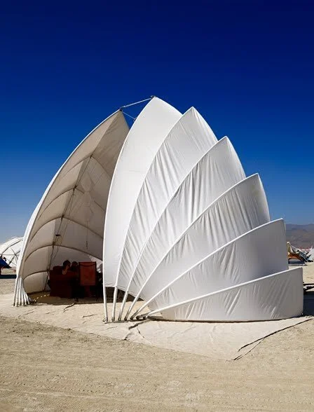
PRECEDENTS
Source materials used as references for the design and development of the mobile sancturay:
RENDERS - ROUND 1
First set of mockups created by Owen following our initial dialog:
ROUND 1: OBSERVATIONS & ANALYSIS
Owen presented a number of concept, most of which were exploratory:
“Honeycomb” concept:
I liked the aesthetic and thought it had potential as personal space, but it failed to include a communal component. It also presented potential permit issues in that it was designed to be removed from the trailer and used in a public space. Ultimately I said to Owen that I didn’t think this was the right direction for the design of the Mobile Sanctuary.
“Teardrop” concept:
I liked the form and thought it could work as the main sanctuary shape. Like the honeycomb concept, however, the fact that it was meant to live off of the trailer presented potential permit issues. I said to Owen that the essential teardrop shape could serve as the basis for the final design, but it would need to be integrated into the trailer.
“Seashell” concept:


I liked how one space could provide personal as well as communal space simultaneously, and there was a nice aesthetic relationship between those two aspects of the form. It had the same issues as the the “teardrop” and “honeycomb” concepts, however, since the structure was intended to be removed from the trailer and used on public grounds. I communicated to Owen that some variant of this could be integrated into the final design, but not in this execution.
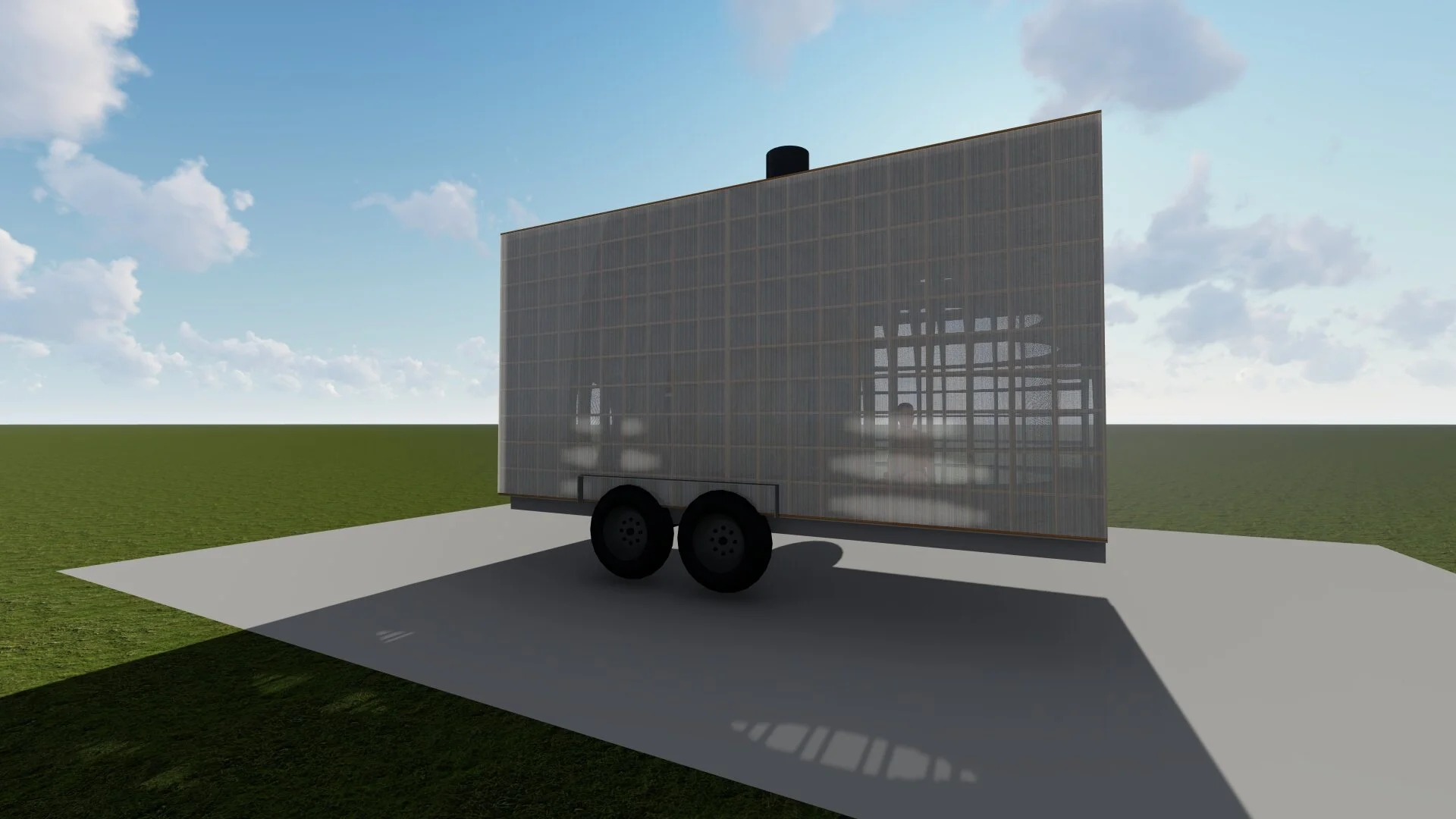
“Cube” concept:
I thought this concept had promise and was worth exploring further. In particular I thought there was an intriguing interplay between the translucent glass exterior and the organic interior sanctuary space, and I was curious to see how Owen might flesh out the design. Owen suggested the dimensions be stretched in order to accommodate an access ramp, which made sense to me. We also looked at a precedent of a modern urban sweat lodge concept that I thought could inspire the details for the interior sanctuary space:
I showed Owen, as well, a photo of the New York Hayden Planetarium which had a similar “round form framed by box form” aesthetic that could further guide his follow-up renders.
RENDERS - ROUND 2
Second set of mockups created by Owen following feedback and follow-up discussion:
VIDEO FLY-THROUGH
Animation revealing details of 2nd-round mockup:
ROUND 2: OBSERVATIONS & ANALYSIS
There were pros and cons to this concept:
Pros:
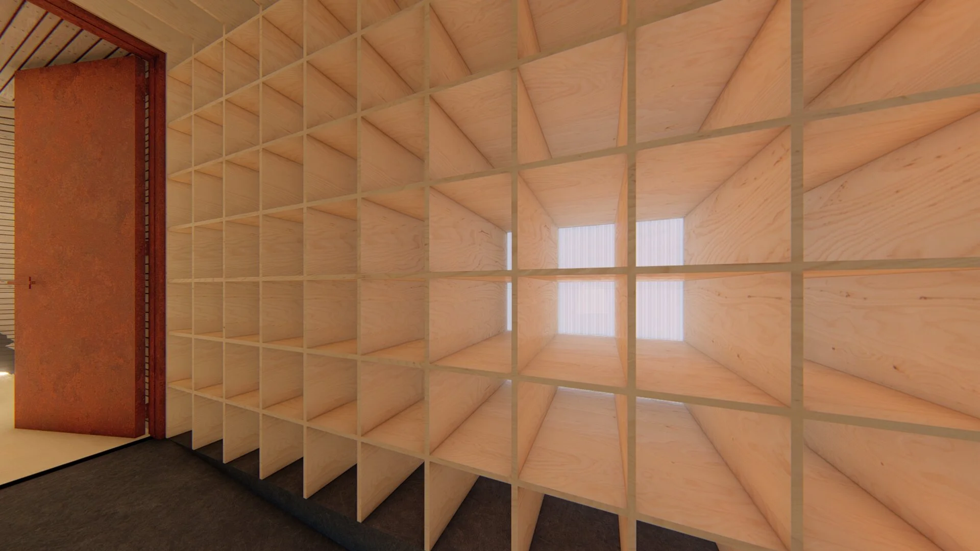
• I liked how the “hallway” area served as a nice transitional space between the exterior urban environment and the sanctuary space.
• I liked that the “hallway” walls could serve as storage space
Cons:
• I felt the overall aesthetic looked a bit too “cell” like, giving the feeling of being trapped, rather than safe and supported.
• I was concerned that the boxy aesthetic reinforced the urban aesthetic rather than presenting a respite from it. It came across as utilitarian and industrial, rather than organic.
• I thought that the interior sanctuary space was too small in relation to the “hallway” area and rectangular exterior, reinforcing the “trapped” feeling (like an insect caught in amber).
• I was concerned that the cubicle spaces would be a challenge to keep clean.
• No skylight.
• Interior door seemed extraneous and interfered with the continuity of the sanctuary space.
• Sauna structure was too tall and interfered with the communal experience.
Ultimately I expressed to Owen that I didn’t think this was the right direction.
For Round 3 we discussed returning to a more organic shape as the dominant aesthetic, in order to provide a nice contrast with the boxy urban environment. We discussed ways in which the hallway area and trailer platform could more organically transition into the sanctuary space. We each thought of the design of an aerodynamic bike helmet as a possible precedent:
RENDERS - ROUND 3
Third set of mockups created by Owen following feedback and follow-up discussion:


ROUND 3: OBSERVATIONS & ANALYSIS
I had asked Owen to create a variety of sketches for this round, rather that one more fleshed out concept. As per this directive, what he presented was less refined than the mockups in previous rounds, but one of the variants struck me as hitting all the marks, even having an overall aesthetic that I felt was greater than the sum of its parts:
I pretty much loved everything about this concept and thought Owen hit it out of the park. I loved in particular how he had achieved the goal of having the organic spheric sanctuary area merge elegantly with the rectangular platform. And I really loved how he had incorporated a triangular “lancet” arch entranceway into the design, which was an innovation (inspired in part by some of the precedent material) that I felt greatly enhanced the overall design by adding a few unexpected aspects:
• Suggests a unique “possibility of experience”
• Gives the structure a “sanctuary” feel by visually directing ones attention “upward” or “heavenly”
• Takes an innovation of western architecture and elegantly marries it to the more eastern and indigenous dome form of the sanctuary space.
Ultimately I feel this design beautifully bridges cultures and traditions while fully serving the goal for the project of creating an “agnostic” sanctuary space. The end result, like all great design, winds up serving the intended functions while creating surprise aesthetic and experiential enhancements, and being a truly unique form unto itself. It might even be, ala the bike helmet precedent, aerodynamic!
The next phase involves refining the concept in the following discussed ways:
• Clarify hallway design
• Refine inner entrance area
• Increase size of skylight
• Incorporate “sweat” pit and removable altar pillar
• Various detail refinements (inclusion of LED lights in hallway and around sanctuary perimeter, determining interior materials, etc.)
VIDEO FLY-THROUGH (refined)
Animation revealing details of 3rd-round mockup following refinements:
Next steps: iterate, iterate, iterate!


